
Pop-ups definitely have a place in web design with a proper strategy. While I use pop-ups on my own site as well as the sites I build for bookkeepers, I don’t recommend them as soon as the website opens up.
This is normally viewed as intrusive – kind of like walking through the mall and having a salesman ask you to buy something before you’ve had a chance to look around. It doesn’t give users the best experience and often just annoys people.
Instead, here are two simple alternatives:
Two alternatives for pop-ups
1. Create a separate page for email signups
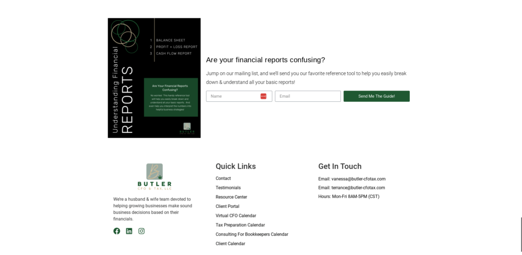
Having a separate page for email signups, also known as a landing page, makes it easy to send and share the link on social media. Below is an example of a landing page I designed for one of my clients, Vanessa.
Once someone clicks the “Send Me The Guide” button, the action triggers a pop-up form to appear and collect the website visitor’s name and email address.

2. Add a signup form to the footer of your website
Having an email signup form in the footer of your website makes sure it’s visible and easily accessible on each page of your website so visitors who aren’t ready to take the next step to book a call or contact you have a clear, low-risk action to take.
Bonus points if you offer a valuable free resource, also known as a lead magnet, in exchange for their email address like in the example below!
What do you think about pop-ups from a consumer’s perspective when you visit a website? Do you find them annoying? Do you quickly close them out to continue browsing? Or, do you find them useful?